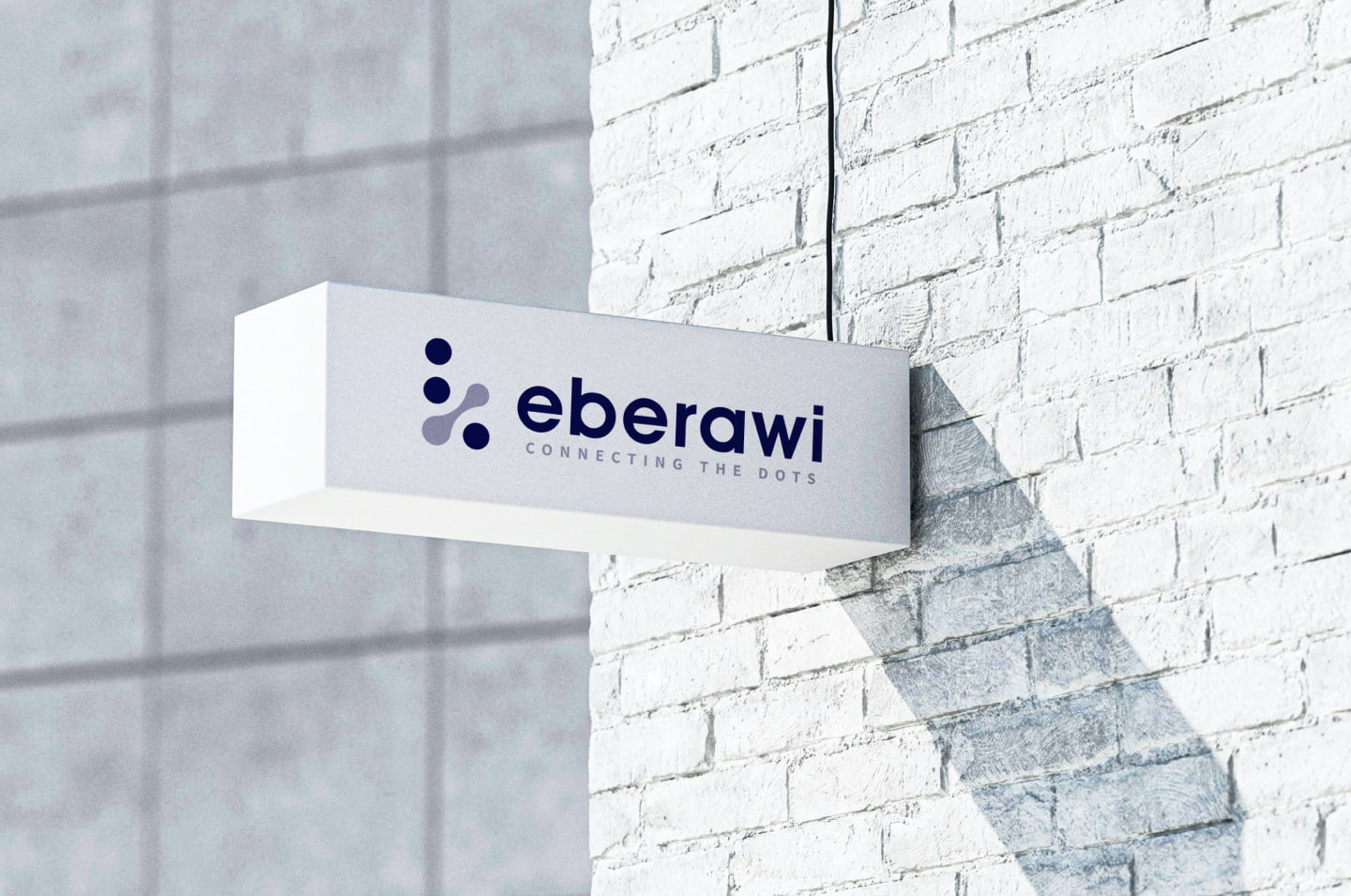
Brand Philosophy
We have chosen to build our brand name on a sturdy foundation of four influential words: e, be, era, raw, and i. When placed together; the emergence is a powerful anecdote of the exceptional services that we provide - bringing structure and harmony to all our projects equally. We love what we do and strive to work cohesively toward our vision.

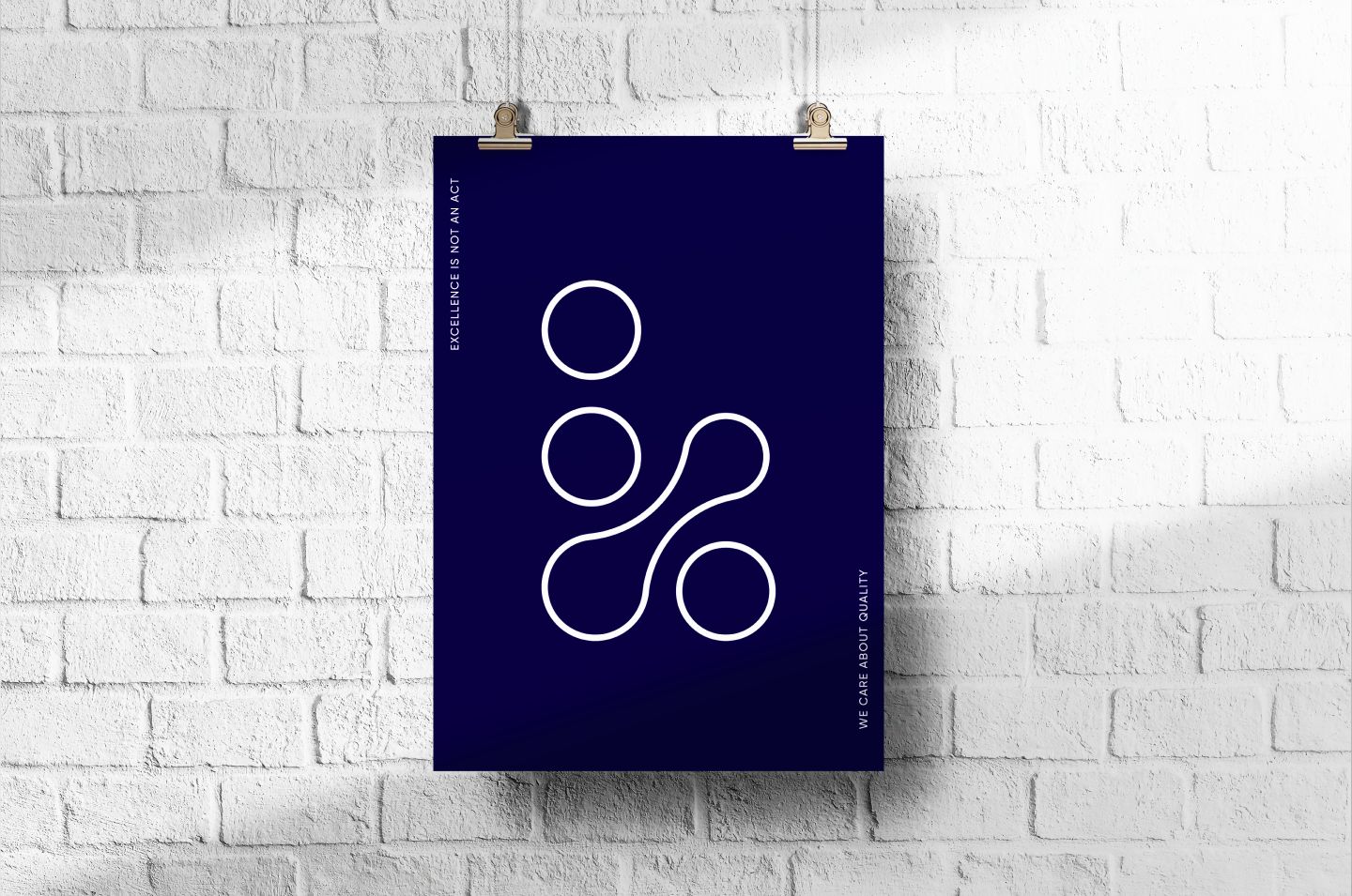
Golden Ratio
The need for a bold and distinctive logo that devoid of any extraneous elements is the core of a good logo. eBerawi’s logomark was created with just one basic shape: a circle. In design, certain elements are used to signify meaning. Since a circle is a line that never ends, it represents movement.
We meticulously placed five circles together using the Golden Ratio proportions. Briefly, the Golden Ratio number is very useful in creating beautiful and perfectly balanced designs.

Behind The Dots
When a line is continuously drawn, the outline of an object becomes apparent. This simple, yet profound methodology is what has appealed to us in using the English idiom of “connecting the dots”. We can culminate the noise of various ideas into one single entity by joining its dots. This applies to everything we do; we simplify complexities using this process.
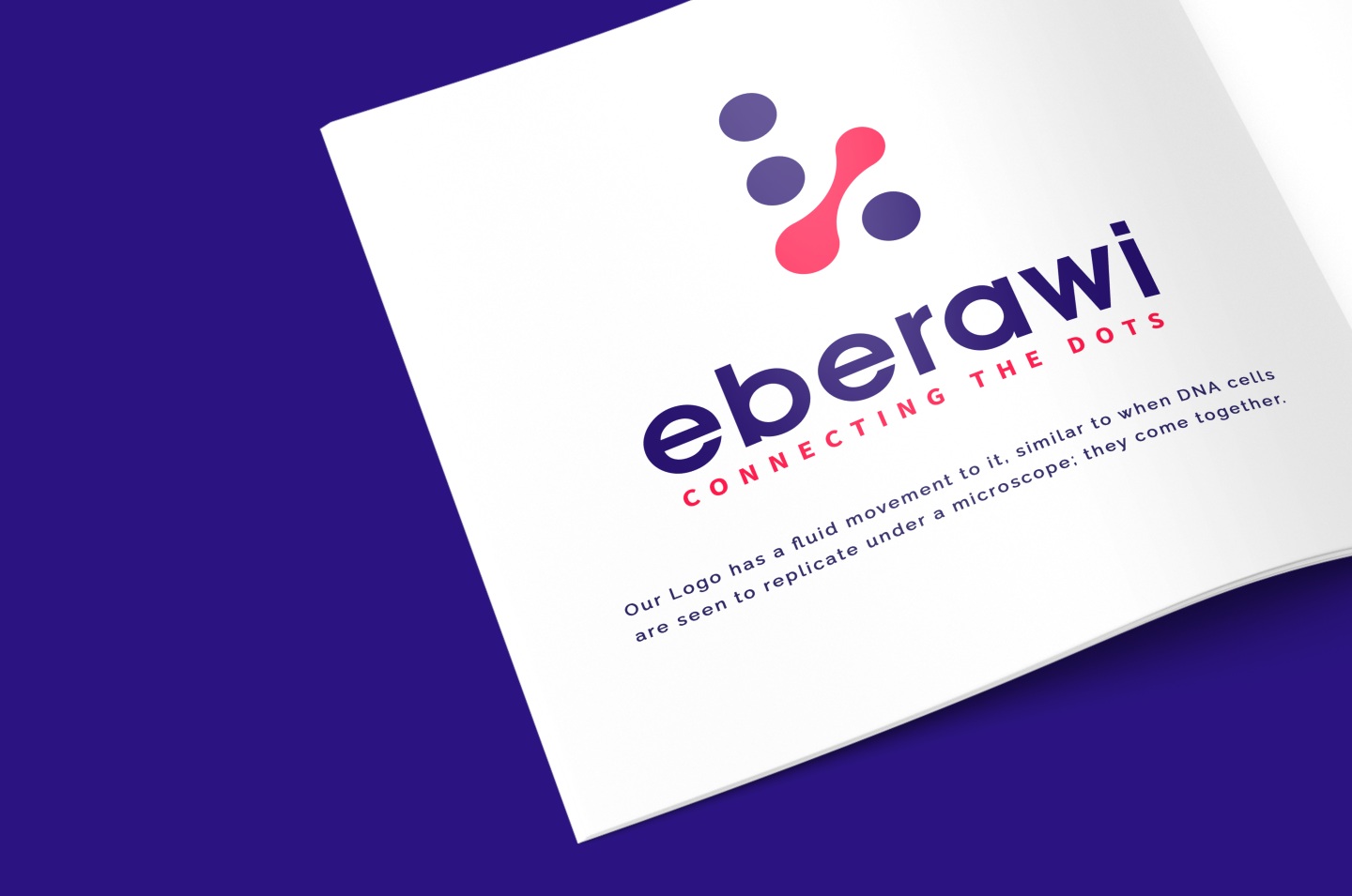
Fluid Functionality
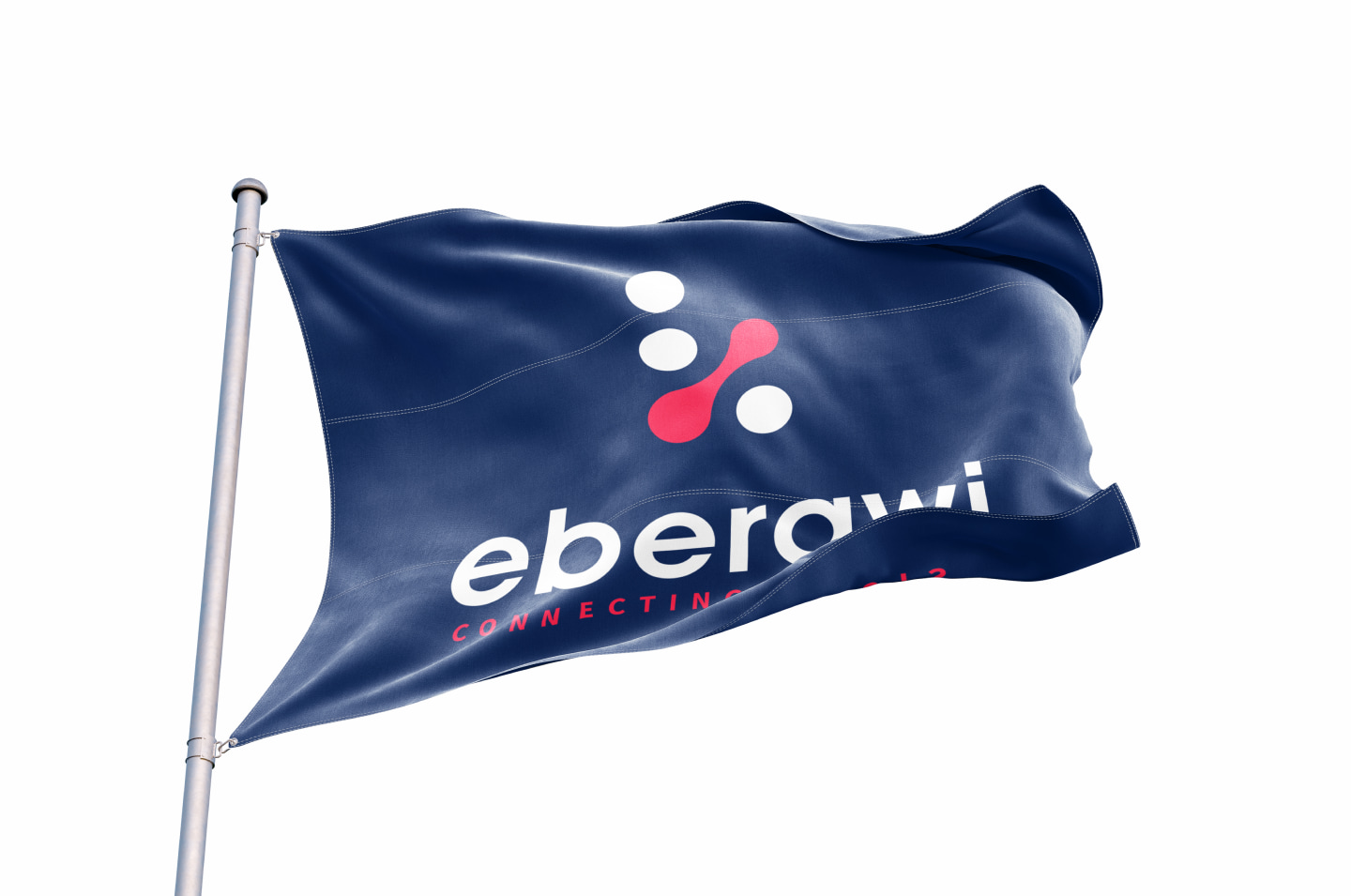
Our logo has a fluid movement to it, similar to when DNA cells are seen to replicate under a microscope; they come together. This idea reflects our holistic capabilities in covering all angles of the client’s requests, and most importantly, it’s functionality. It is essential that our logo not only has an aesthetic appeal to its audience but that its purpose is apparent as well.